 |
Chart.io vs DataHero
May 25, 2023 | Author: Michael Stromann
1
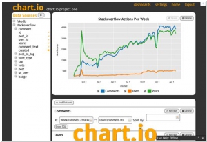
Create interactive charts and perfect dashboards through an intuitive drag and drop interface. Switch from basic tables to sophisticated data visualizations in a single click. Powerful filters let you slice and dice your data, and you can drill down into most charts without configuring a thing.
0
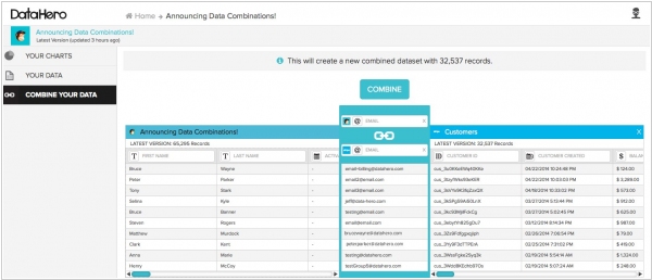
DataHero connects directly to the services you use everyday, giving you instant access to your data no matter where it is. Instantly access your information in SaaS services, cloud storage drives, and even Excel spreadsheets on your laptop or tablet. DataHero's Data Decoder analyzes the structure of your data to find patterns and surface valuable insights automatically. Customize the suggested visualizations or create your own using DataHero's intuitive drag-and-drop interface.
Chart.io and DataHero are both data visualization and analytics platforms that aim to simplify data analysis for businesses, but they have some key differences.
Chart.io is a powerful data exploration and visualization tool that allows users to connect and analyze data from various sources. It provides a user-friendly interface with drag-and-drop functionality to create interactive charts, dashboards, and reports. Chart.io emphasizes real-time data analysis, allowing users to explore and visualize data instantly. It offers robust features like data connectors, SQL querying, and collaboration tools to help users uncover insights and make data-driven decisions.
DataHero, on the other hand, is a self-service data visualization platform that focuses on simplicity and ease of use. It provides pre-built connectors to popular data sources and offers a visually appealing interface that makes it easy for non-technical users to create charts and visualizations. DataHero emphasizes automated data analysis and provides insights and recommendations to help users understand their data better. It offers features like data blending, drag-and-drop chart creation, and sharing capabilities to simplify the data visualization process.
See also: Top 10 Business Intelligence software
Chart.io vs DataHero in our news:
2014. SaaS analytics service DataHero becomes free
Analytics startup DataHero, which enables business users to visualize their crucial data, is transitioning to a fully freemium model. This new pricing strategy comes at a time when the company is witnessing substantial growth in its customer base and expanding its range of integrations with numerous services. Since its inception, DataHero has provided support for popular data sources like Stripe, Google Drive, MailChimp, and Salesforce.com. Recently, on Tuesday, it also introduced support for several new sources including Keen IO, Zuora, Pardot, and Zendesk. Under the updated model, users of the free version can now merge data from two sources into a single view and analyze files up to 2MB in size. Conversely, users who subscribe to the $49 per month plan can combine an unlimited number of sources and analyze 10MB files, in addition to accessing other premium features.